
A configurator working against its users
The Build and Price tool sits at one of the most consequential moments in Kia's digital funnel: the point where a shopper moves from browsing to seriously considering a purchase. Get them through it, and they connect with a dealer. Lose them, and they leave without a lead.
I was brought in on a tool with a completion problem. The prevailing diagnosis was a cluttered interface, with visual cleanup as the fix. I set a different direction: the problem was architectural, and we needed to solve it, not repaint it.
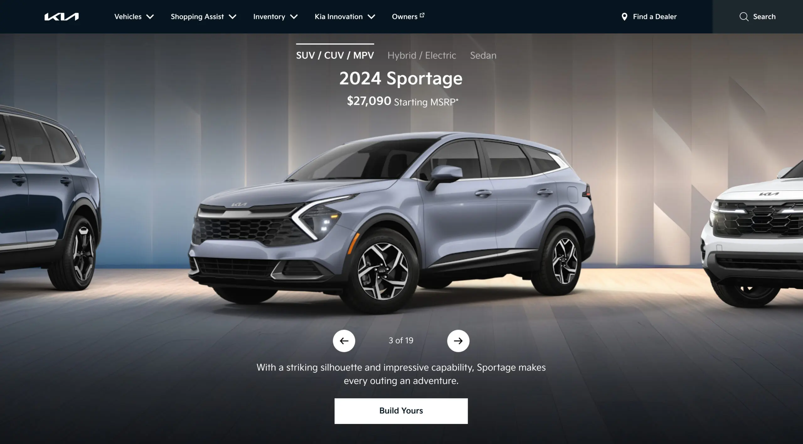
The X marks were the symptom. The architecture was the disease.
The tool presented everything at once: trim at the bottom, color tabs side by side, a 360 viewer showing a car unrelated to the active configuration. People made decisions in the wrong order, with no sense of how each one constrained the next.
The X marks on the color swatches told the real story. Users reached color selection having already locked a trim that silently eliminated most of their options, and hit that wall after enough invested time to abandon.
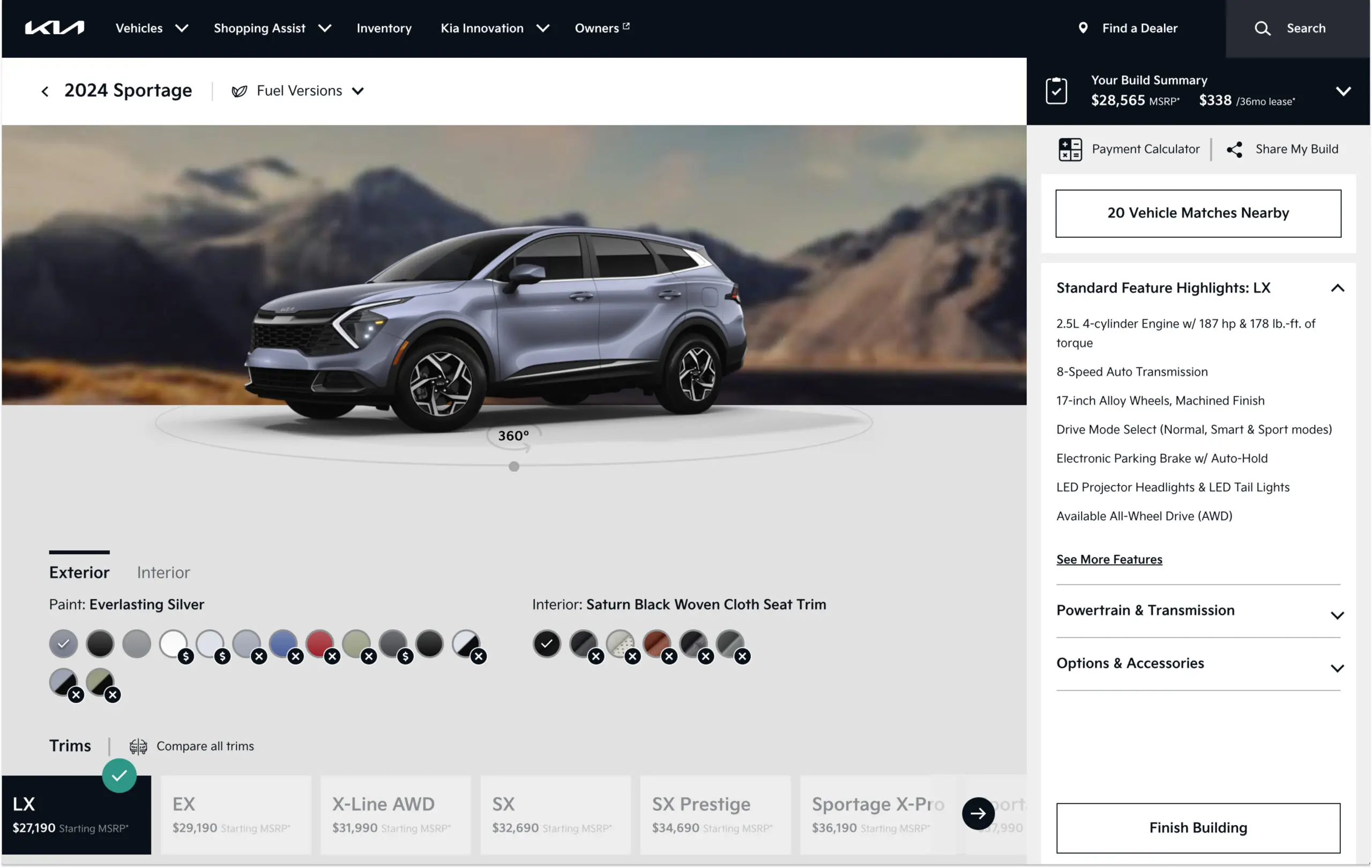
Trims sat at the bottom of the page, so users selected colors before locking in a trim, creating conflicts that stayed invisible until it was too late.
X marks revealed unavailability after selection, not before. Users hit dead ends they had no way to anticipate, often after significant time invested.
The 360 viewer showed the car in a fixed color with no connection to the active configuration. What users saw and what they were building were two different things.
"I picked my color and then found out it wasn't available for the trim I wanted. I just gave up."
Usability study participant, 2022
Don't show all options. Show the right options.
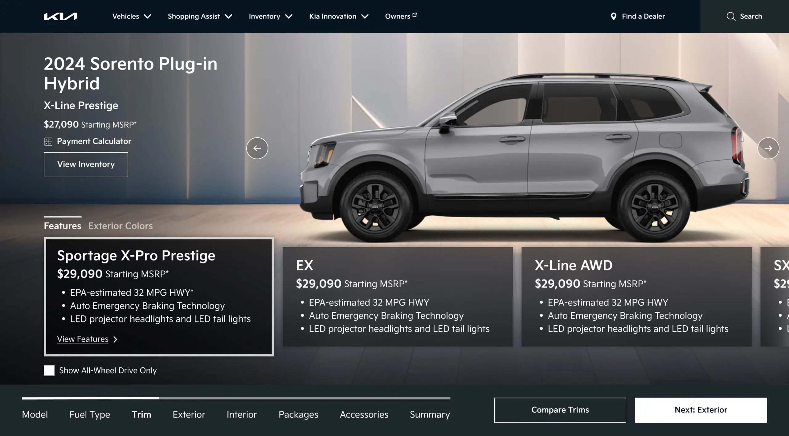
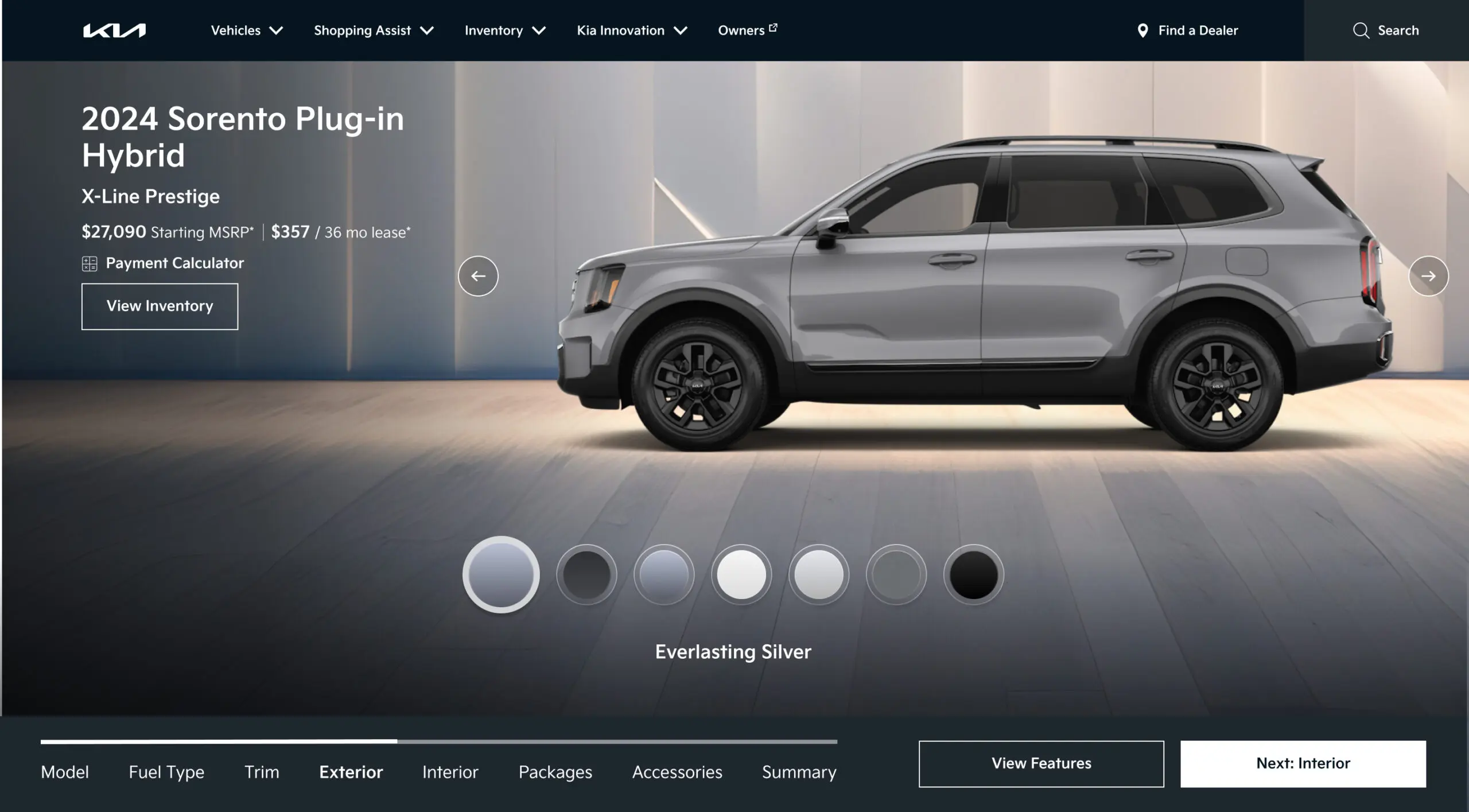
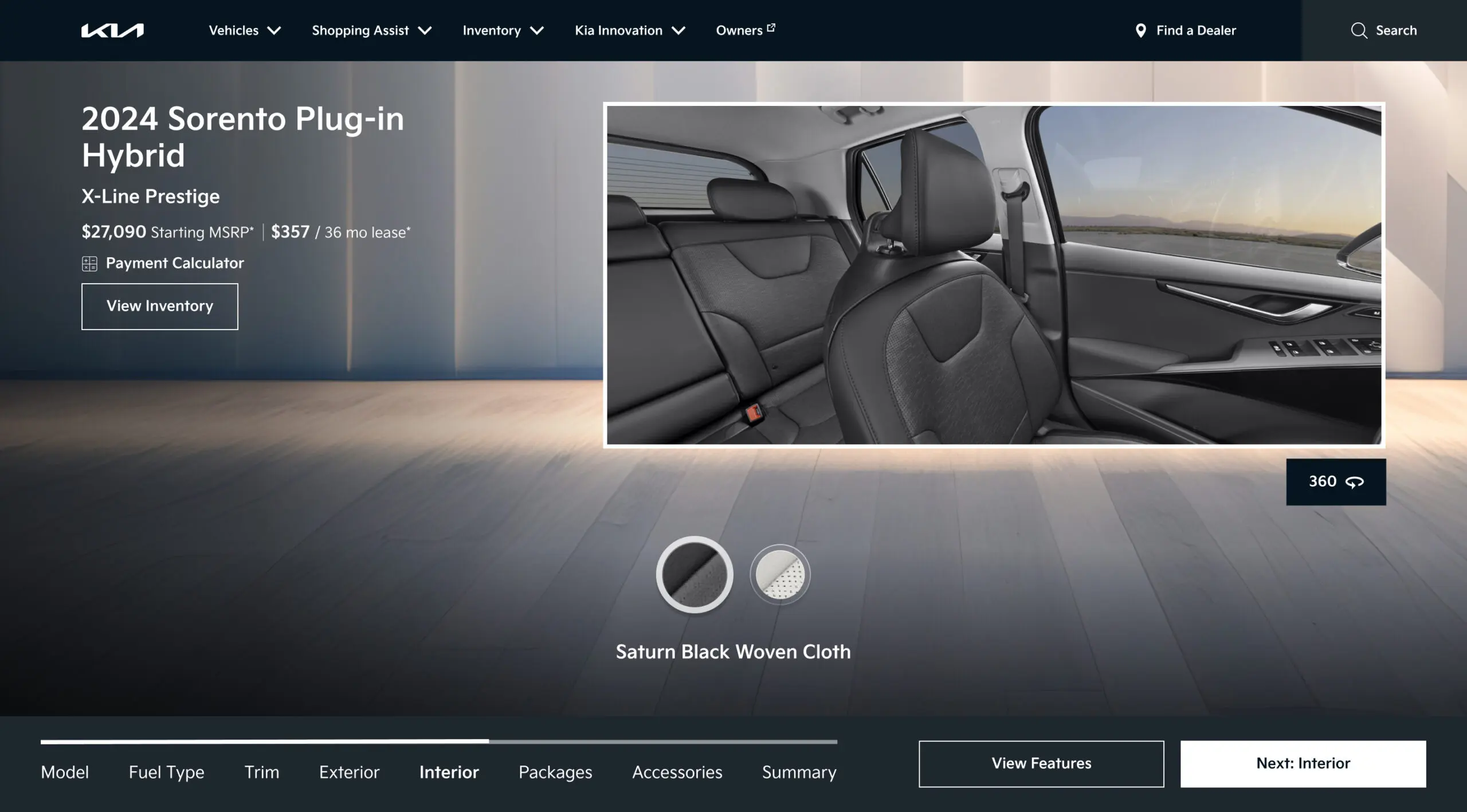
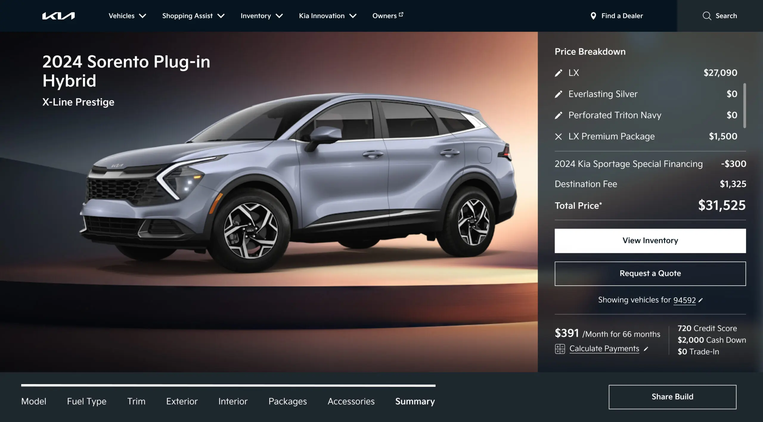
The bet was simple: scope each choice by what the user has already selected, and conflicts become impossible. Order the flow by dependency, trim, then exterior, then interior, and every option shown is valid. The X marks don't disappear because we hid them; they can no longer exist. I paired this with live visualization, connecting the 360 viewer to the configuration state so the car on screen is always the car being built.
Sequential dependency flow
Decisions sequenced so each step scopes the next. Trim locks exterior options, exterior locks interior. Conflicts are structurally impossible.
Live vehicle visualization
The vehicle image updates with every selection, connecting the 360 viewer to the configuration state for the first time.
Persistent price summary
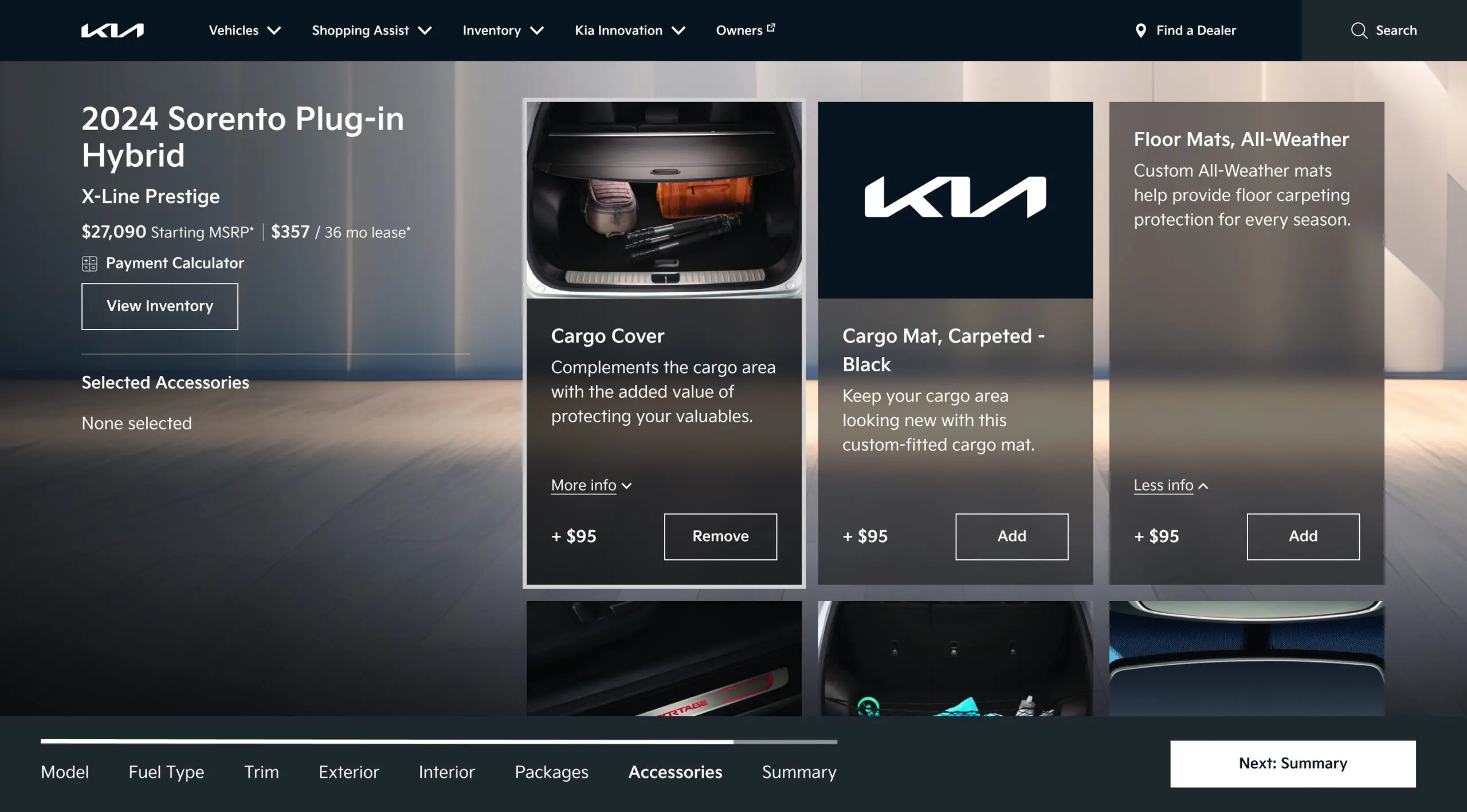
Running cost visible at every step, eliminating sticker shock at the end and building financial confidence throughout.
Direct path to dealer
The flow ends with a natural handoff to dealer contact and local inventory, capturing intent at its highest point.
Selling the vision before building it.
A rethink of this scale needed alignment before any high fidelity work. I set the direction and had the team build a detailed interaction model, giving client and engineering a concrete picture of the proposal and earning conviction from stakeholders who had favored a cosmetic fix. We validated before committing: two rounds of moderated testing confirmed that scoping by dependency reduced abandonment and lifted completion, and I secured approval to take the sequential model to production.
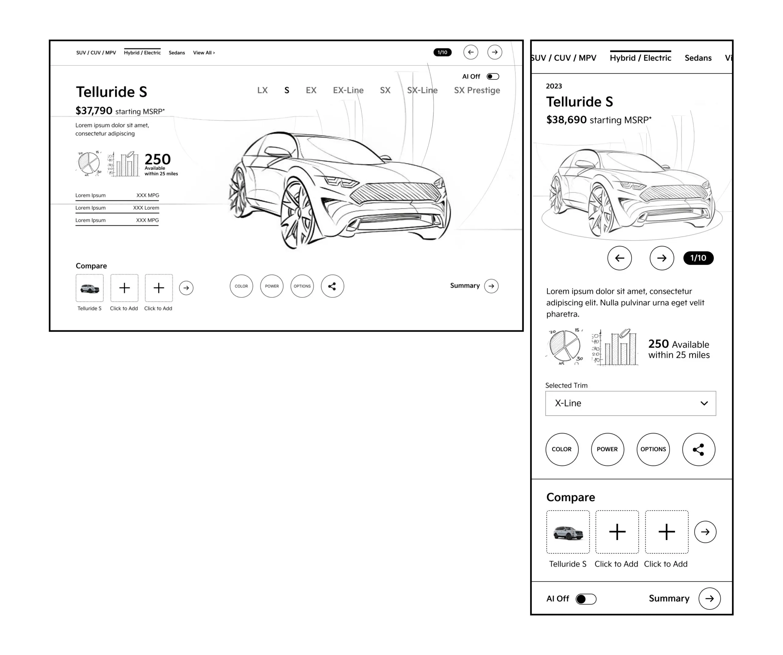
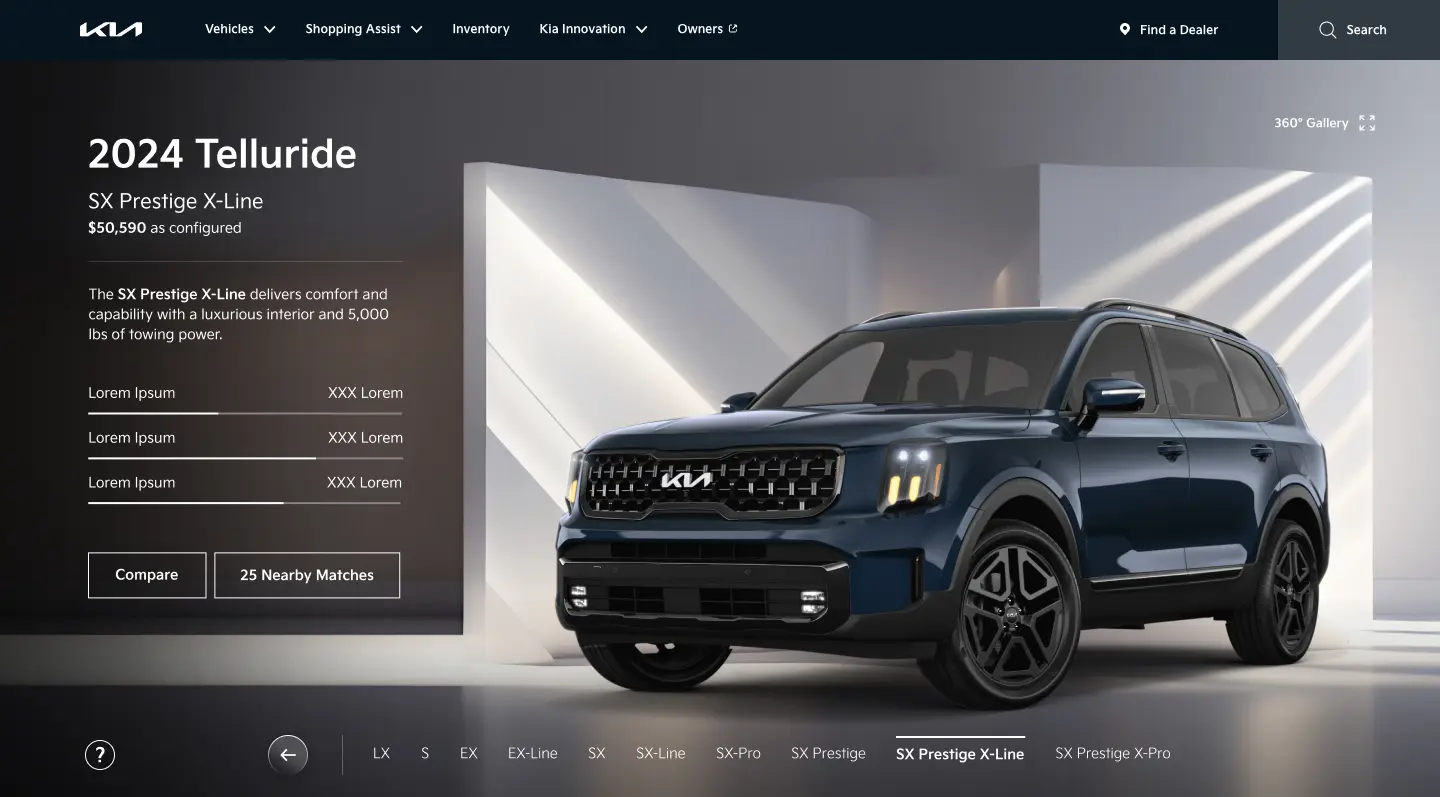
The car you see is the car you're building.
Setting direction was one part of the job; shipping it was the other. I stayed close to the craft across the build, guiding the interaction specification and holding the work to the approved direction in design reviews. The hardest problem was the constraint system, surfacing what was unavailable and why without creating dead ends. The final experience centers on a live visualization panel, with each step presenting only valid options and the running price visible throughout.
Information Architecture
Directed the restructure of the decision hierarchy into dependency order: model, trim, exterior color, interior, packages. Each step scopes the next, making conflicts structurally impossible rather than just better communicated.
Interaction Specification
Guided a 140 plus state interaction document covering all step transitions, loading states, constraint messaging, nearest alternative logic, and edge cases. It became the shared source of truth for design, engineering, and QA.
Visualization Integration
Set the design for the live vehicle update system so the image state is always a direct reflection of the user's current configuration, not a static representation of the model.
Usability Validation
Oversaw two rounds of moderated testing with 24 participants. Round one validated the sequential model and surfaced issues in package selection. Round two cleared the revised design for production.
Dev Handoff and QA
Delivered a complete Figma component library, motion spec, and QA checklist. The team worked in two week engineering sprints through launch to protect design intent.
What the numbers said.
After launch, the redesigned configurator delivered a 105% lift in high value actions and a 68% reduction in conflict errors, alongside 6% more time spent in the Build experience. Each number traces directly back to the structural fix, not to cosmetic changes or repositioned CTAs.
With the dead ends gone, users finished what they started, and a live visualization kept them engaged through the flow. The redesign shipped as the new Build and Price experience on Kia.com, replacing the simultaneous-selection tool with a dependency scoped flow.