
Mint Mobile Plans Funnel Redesign
I led the experience design team in a close partnership with Mint Mobile's ecommerce organization to redesign the purchase funnel from the ground up. My job was to set the direction, keep the team focused on what actually mattered, and make sure every design decision connected back to the thing Mint cared most about: getting more people through the funnel and into a plan.
Rather than treating this as a design execution engagement, I positioned the team as strategic partners from the start, embedding directly with Mint's ecommerce stakeholders to establish a shared understanding of user behavior, funnel data, and business priorities before a single screen was designed.

The funnel was losing people before the decision
Mint Mobile's purchase funnel had a friction problem. Users were dropping off before completing plan selection, not because they weren't interested, but because the experience wasn't guiding them effectively. The plan selection UI overwhelmed users with too many simultaneous choices, and the SIM card decision layer added cognitive load at exactly the wrong moment in the flow.
The multi line builder, a high value surface for families and customers adding lines, was buried and difficult to discover. Every one of these friction points represented real revenue being left on the table.
Reduce Funnel Drop off
Identify and eliminate the highest impact friction points across the Home Page, Plans Page, and PDP to keep users moving toward purchase.
Simplify Plan Selection
Reduce cognitive load at the plan selection step so users could make a confident choice faster, without feeling overwhelmed by options.
Integrate SIM Seamlessly
Weave SIM card selection into the flow in a way that felt natural rather than interruptive, removing a known drop off trigger.
Surface Multi Line Value
Make the additional lines builder more prominent and intuitive to capture more multi line customers who were failing to complete the flow.
Setting the strategic direction
My first priority was establishing the design team as credible strategic partners rather than order takers. I facilitated working sessions with Mint's ecommerce leadership to align on the funnel data, identify the highest leverage intervention points, and set a shared definition of success before any design work began. That alignment upfront was what allowed us to move quickly once we were in execution mode.
I structured the team's approach around two parallel tracks: a data informed exploration of the plan selection model, and a mobile first redesign of the full funnel. I set the creative direction, established the design principles that would govern every decision, and ran weekly reviews to maintain quality and momentum across both tracks simultaneously.
Stakeholder Alignment
Embedded with Mint's ecommerce team from day one to build shared context, align on metrics, and ensure design decisions were grounded in business strategy, not just UX intuition.
Team Direction
Set the creative and strategic vision, structured parallel workstreams, and maintained design quality through weekly reviews as the team moved from concept to delivery.
Cross Functional Facilitation
Bridged design, ecommerce, and engineering throughout the engagement, translating between business goals and design decisions to keep all parties aligned.
Mobile First Principle
Anchored the entire design strategy in mobile first thinking, ensuring that every decision served the majority of Mint's user base where they actually shopped.
From strategy to delivery
Funnel Audit & Strategy Alignment
Led a joint working session with Mint's ecommerce team to audit the existing funnel using analytics, session recordings, and heatmaps. Together we identified the three pages with the highest drop off and set a prioritized roadmap for redesign.
Design Direction & A/B Framework
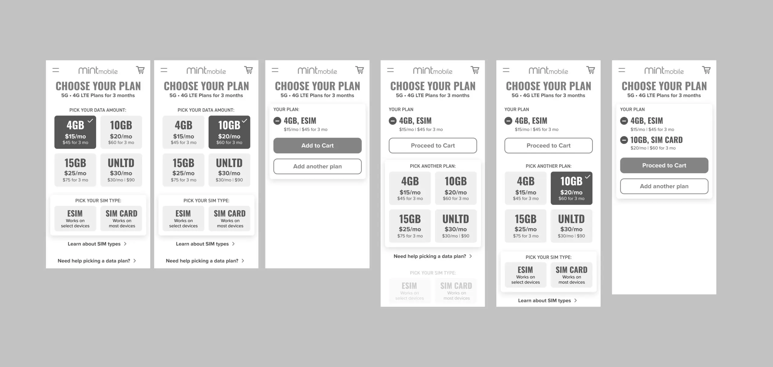
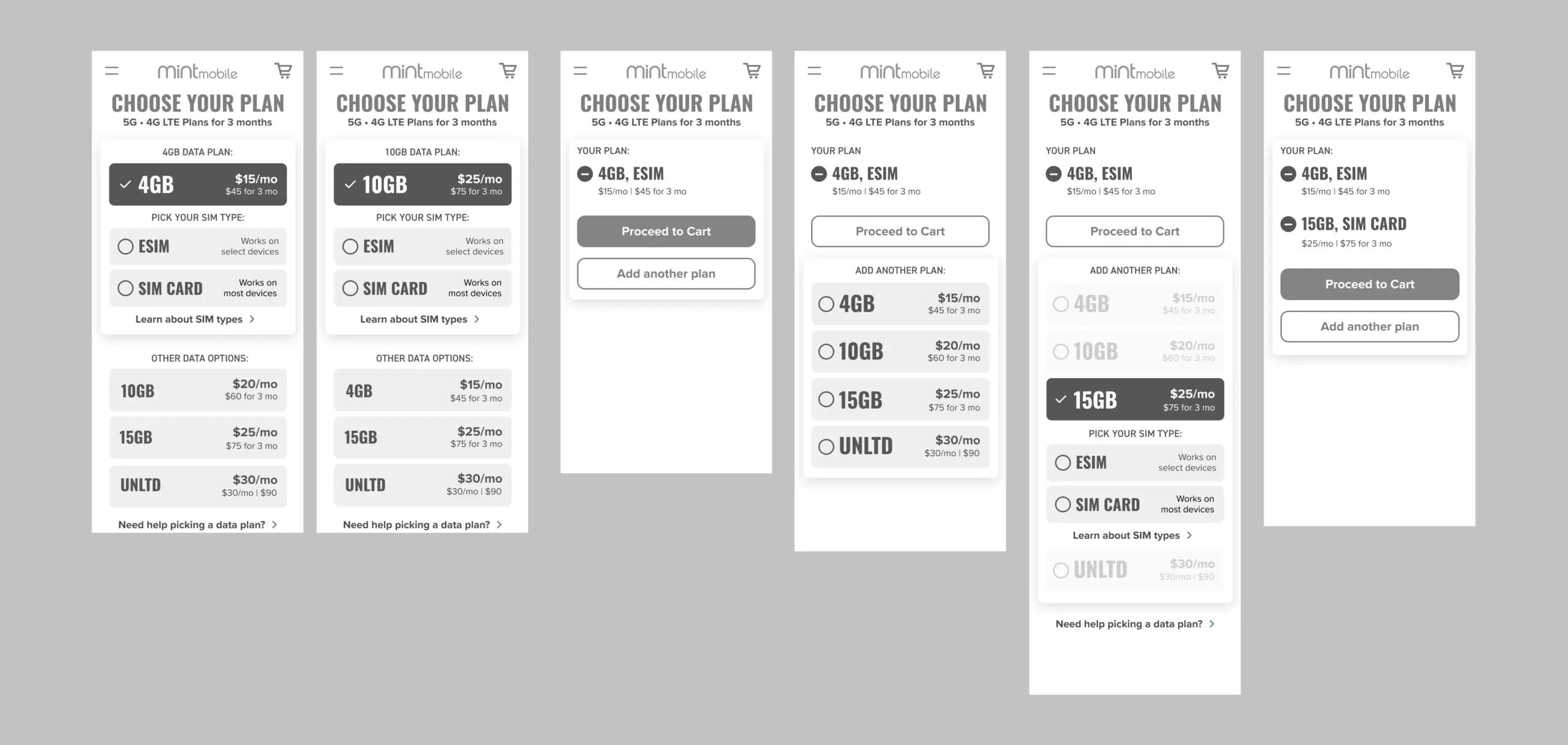
Defined two strategic approaches to plan selection for A/B testing: a preselected plan with predefined data to reduce decision fatigue, versus open selection from scratch. I set the hypotheses, established success criteria with the ecommerce team, and directed the design team's execution of both variants.
Concept Reviews & Iteration
Ran structured design reviews at each stage, pushing the team to pressure test assumptions and validate decisions against the funnel data. Maintained a clear creative direction while giving the team room to explore and bring their own thinking to the work.
Testing & Validation
Testing confirmed that preselecting a plan reduced time to decision without sacrificing flexibility. Grouping plans with an integrated SIM selection outperformed the side by side model in both comprehension and conversion. Results were shared directly with Mint's ecommerce leadership to inform build prioritization.
Handoff & Launch
Oversaw the production of a complete component library, interaction specifications, motion guidelines, and a QA checklist. Maintained design fidelity reviews through the engineering build to ensure the shipped experience matched the approved direction.
Two bets, one question
Before committing to a direction, we tested two fundamentally different approaches to plan selection. The first gave users a preselected starting point, a recommended plan already chosen for them, reducing the burden of an open ended decision. The second started from scratch, letting users choose from the full plan grid. Both were wireframed to the same fidelity and tested with real users under the same conditions.
The goal wasn't just to find the winner, it was to understand why. The data didn't just tell us which variant converted better. It told us where users were hesitating, what language was landing, and which moments in the flow were creating the most friction. That insight carried directly into the final design.
A funnel that guides, not overwhelms
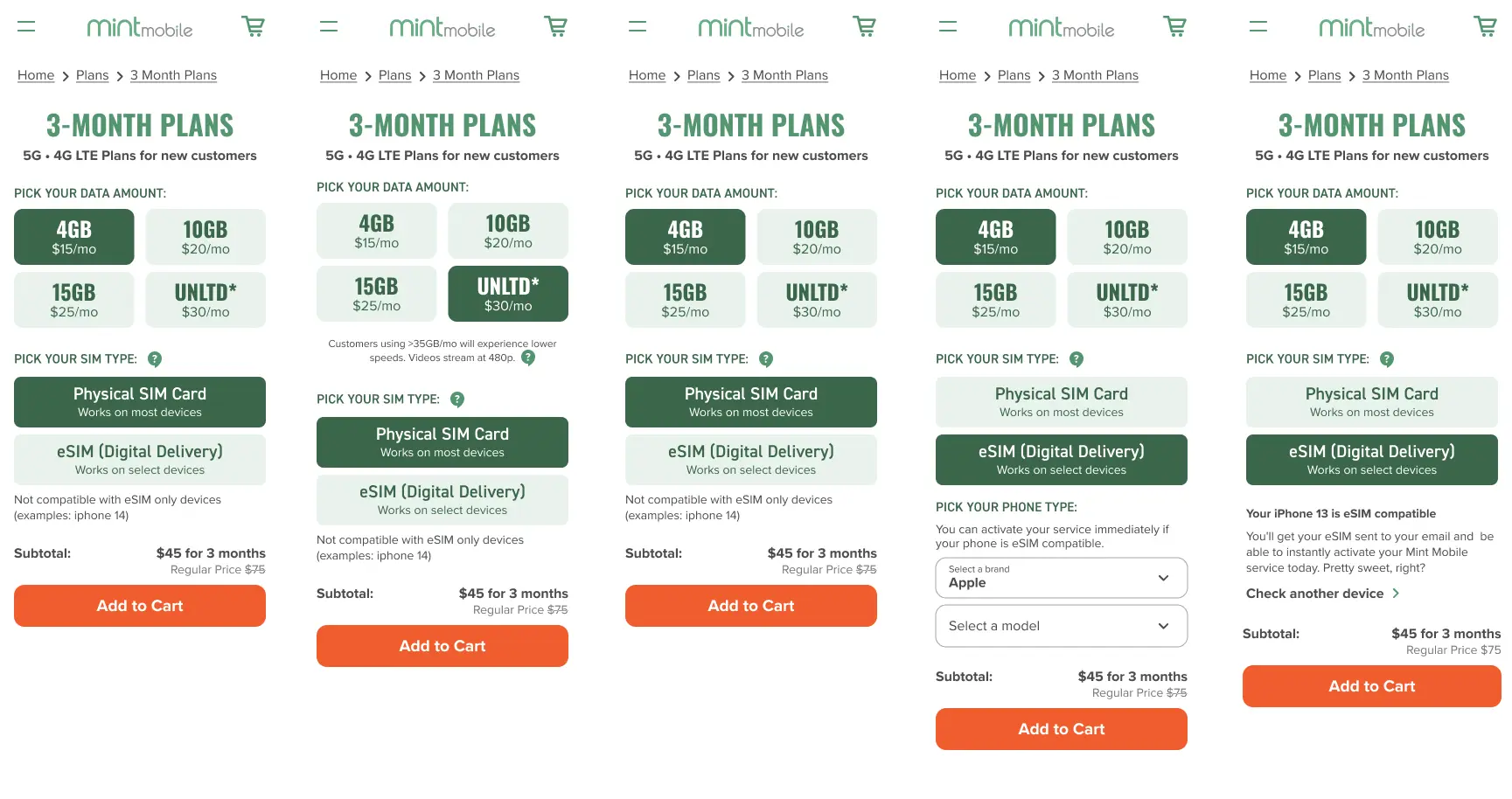
The final design carried the winning logic of the preselected model into a fully realized plans page, giving users a clear recommended starting point while keeping the full plan grid accessible. The SIM card decision was woven in at the natural moment in the flow rather than surfaced as a separate interruption.
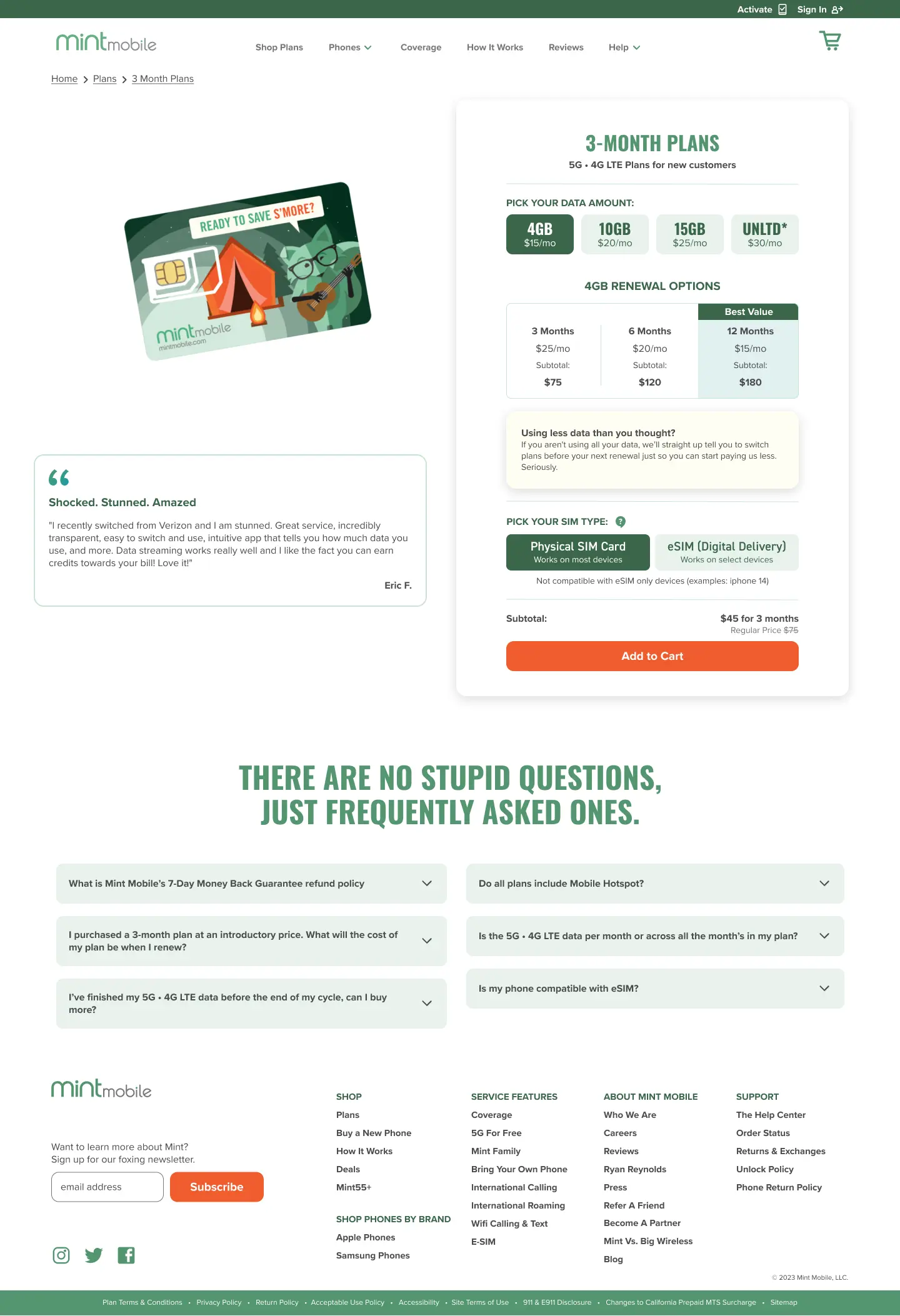
The desktop experience brought the same guided flow to a wider canvas, with the plan grid, SIM selection, and cart summary all visible in a single viewport without requiring the user to scroll to understand their options.
What the redesign delivered
The strategic partnership model was what made the work land. By aligning with Mint's ecommerce team on goals upfront and holding a tight feedback loop throughout, the team's decisions stayed anchored to the funnel data rather than getting lost in late stage revisions. Every change shipped for a reason the client had signed off on.
The redesigned funnel guided users through a clearer path: a preselected plan that cut decision load, a SIM step woven into the flow instead of interrupting it, and a mobile-first build that met users where they actually shopped. The result was a purchase experience that felt easier and more trustworthy to complete across the Home, Plans, and PDP pages.